What I Learned Analyzing 50+ Top Product-Led Homepage CTAs
Marketers have been talking about the importance of call-to-action for many years now. One of the first things we analyze and A/B test is the CTA button.
In product-led companies, where the website is your salesperson, getting the CTA right has a huge impact on your sign-ups. I pored over the hero sections of home pages of over 50 product-led companies to figure out how the PLG greats are doing it.
Observation#1: CTA Classics
What we learned as best practices for a CTA that converts still hold good in the product-led world.
In terms of popularity, Free is the most used word in a CTA on product-led websites, followed by action inspiring words Get and Start.
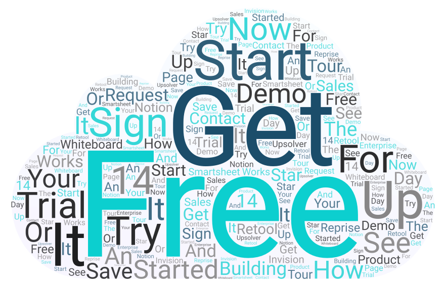
Image: CTA Word Cloud
We still prefer call-to-actions that are less than 5 words. No surprises there!
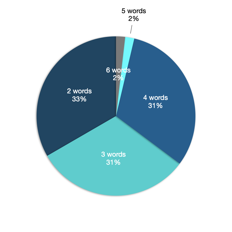
Image: Comparing CTA Length
Observation #2: Lengthy CTAs
Let’s talk about the outliers here. HubSpot gives you the same CTA in their home page’s hero section. Self-serve or get a demo, users can go through all the options listed out in two columns in the next step.
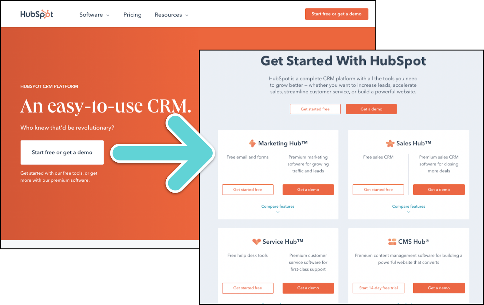
Source: Hubspot.com
Twilio does it even better. Their primary CTA screams action to their users. ‘Sign up and start building’ shows users what to do to get to where they want to be, and how easy it is to start. Clicking the CTA takes you to a form that lists what the user can build using Twilio.
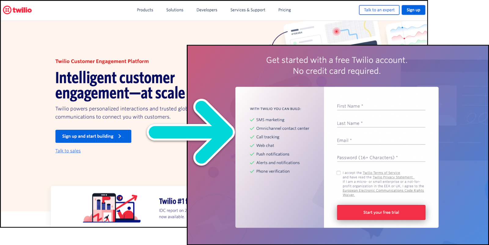
Source: twilio.com
Both Hubspot and Twillio’s CTAs nudge the user to take action with clear messaging and set the user's expectations in the very next step. I’d say the number of words in the CTA button is not a deal-breaker if you can get the aesthetics, positioning, clarity, and messaging right.
While on the subject, Basecamp is a long CTA Hall of Famer! ‘Start a free 30-day trial' is the longest CTA I’ve seen on a homepage hero section. With the new look of their website, they’ve also switched to a 4-word call-to-action. This substantiates the tried and tested performance of a short(er) CTA.
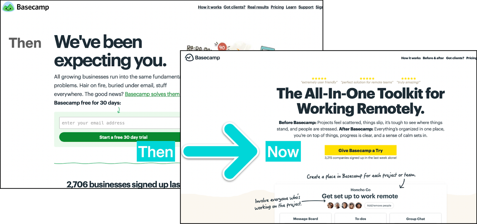
Source: Basecamp
Notice how Basecamp started using their product in the CTA? This gives a segue to my next observation.
Observation #3: Product-Led Call-To-Action
Using the product in call-to-action dates back to before the product-led era. GitHub and Figma are classic examples of using the power of their product to persuade a user to sign up.
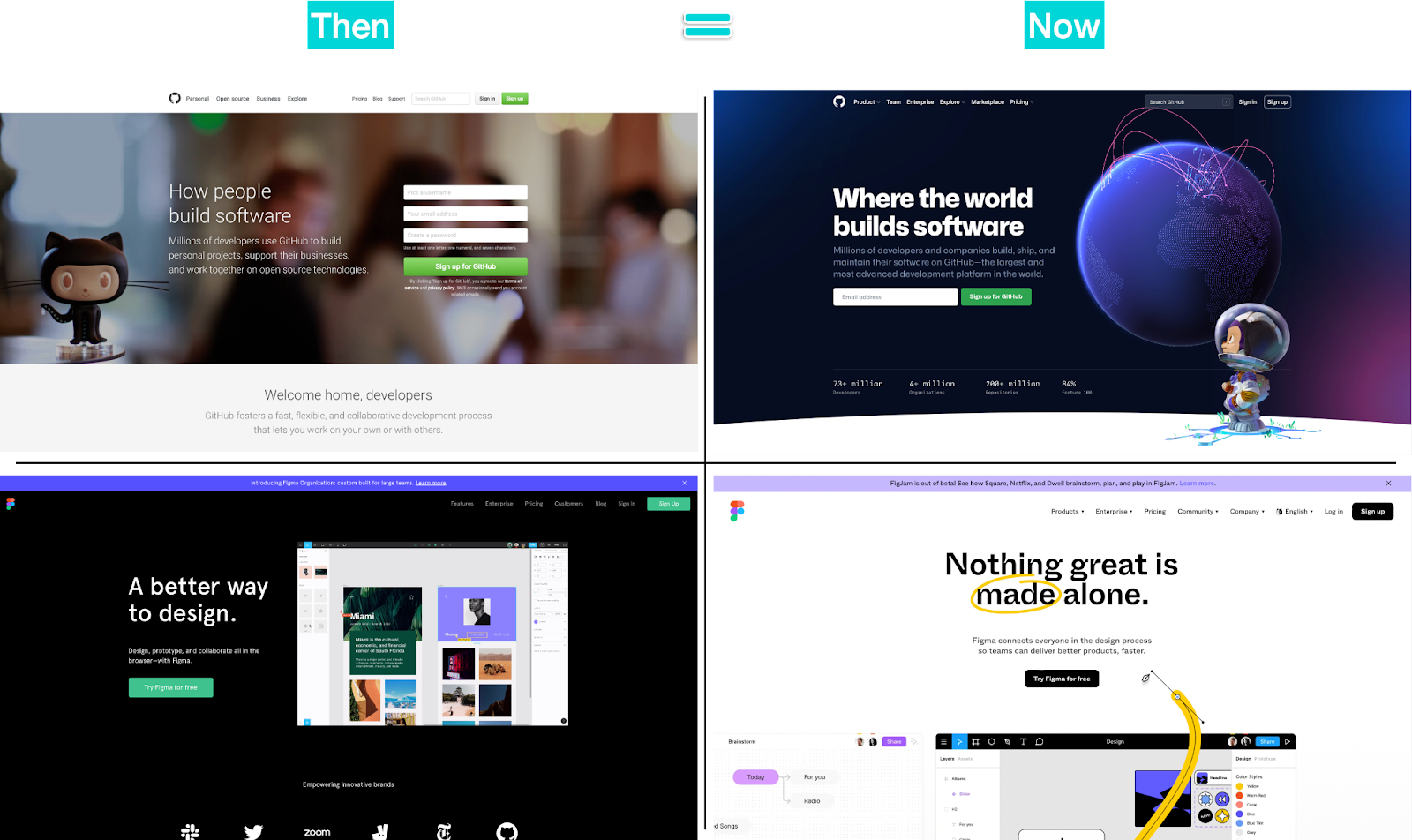
Sources: GitHub and Figma
Their websites went through some changes over the years. But, the primary CTA remained the same. I think it’s safe to say it’s working for them.
Interestingly, I’ve noticed some more top PLG companies following the same path. Loom and Notion decided to include their popular products in their primary CTA not so long ago. Retool, Reprise, Smartsheet, InVision, Prezi, and the list goes on.
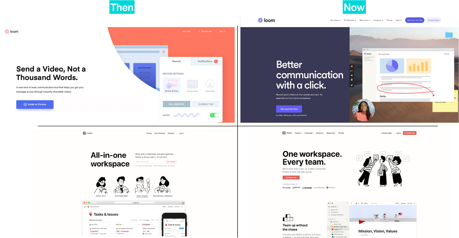
sources: Loom and Notion
Call-to-action with brand names is not exactly a new trend. Many consumer brands have been doing this for ages.
The effectiveness of a call-to-action button depends on different factors like aesthetics, positioning, copy, and delivering on the promise. Having the product name in the CTA may not directly impact your sign-ups. All I am saying is, it shows and reminds the users what they are signing up for. And, it definitely is not another generic clickable button in the likes of ‘Click here' or ‘Sign up’.
Observation #4: Email Field
On average, an email field is the most under-utilized space on almost all the website homepages I’ve analyzed. At this point, we all know what to fill in an email field. Why not use the space to set the user’s expectations about what they are getting by signing up?
Fivetran does exactly that! They showed what the users get - a free trial, for how long - 14 days by signing up with an email address.
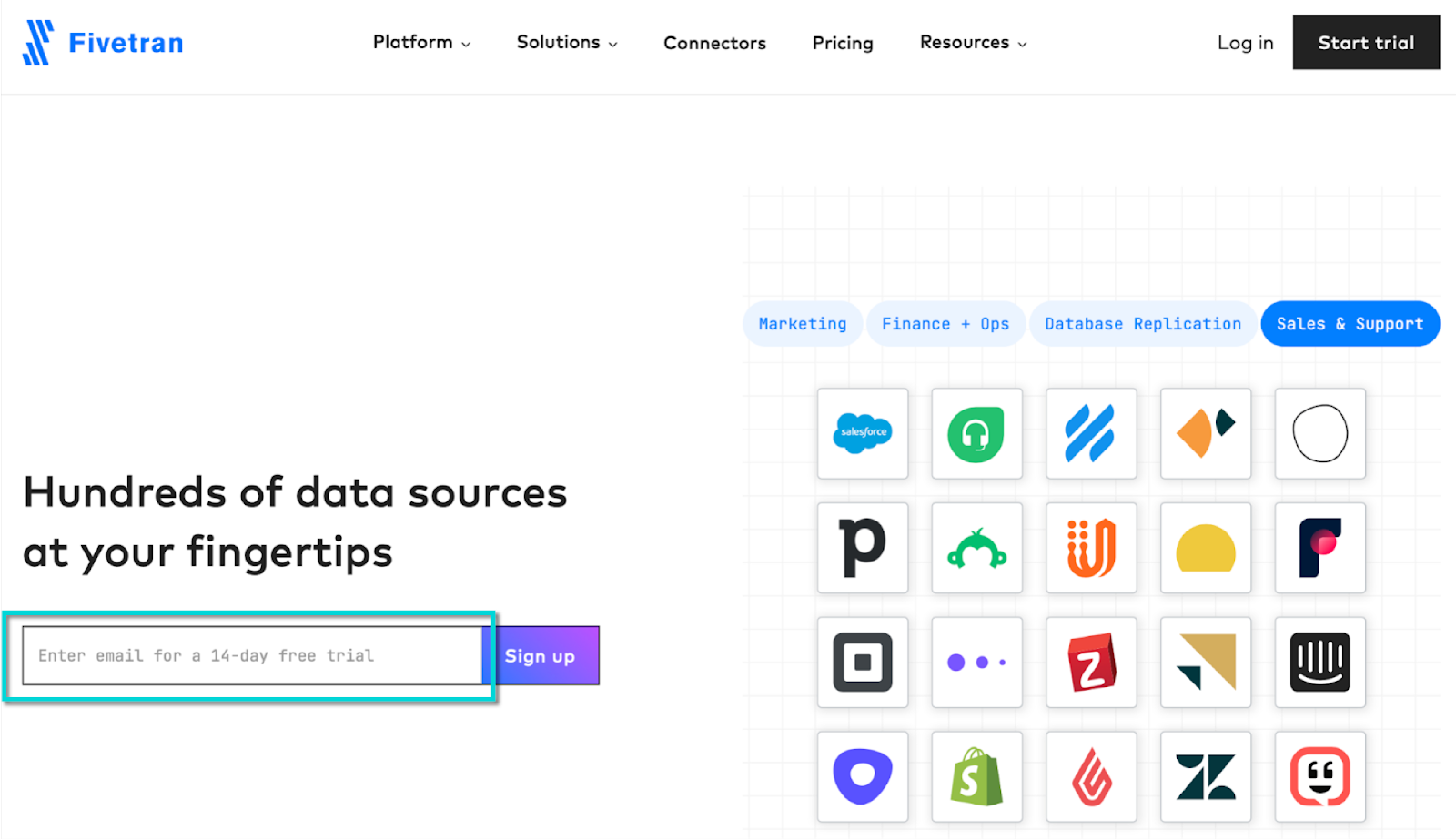
Source: Fivetran
Observation #5: Product in Action
Are you even product-led if you are not showing what your product can do?
Many websites show a glimpse of the product on the homepage hero section. Be it an animation, a recorded demo, or a short product tour - it is at the front a little to the right. Very few PLG websites, Pendo for example, have the product tour as their primary CTA.
Prezi is one of the outliers of this practice. They are a great example of how demo videos can not only show the product but also help communicate the product value. Prezi establishes they are not just a presentation-making software in a series of 5 short videos clips.
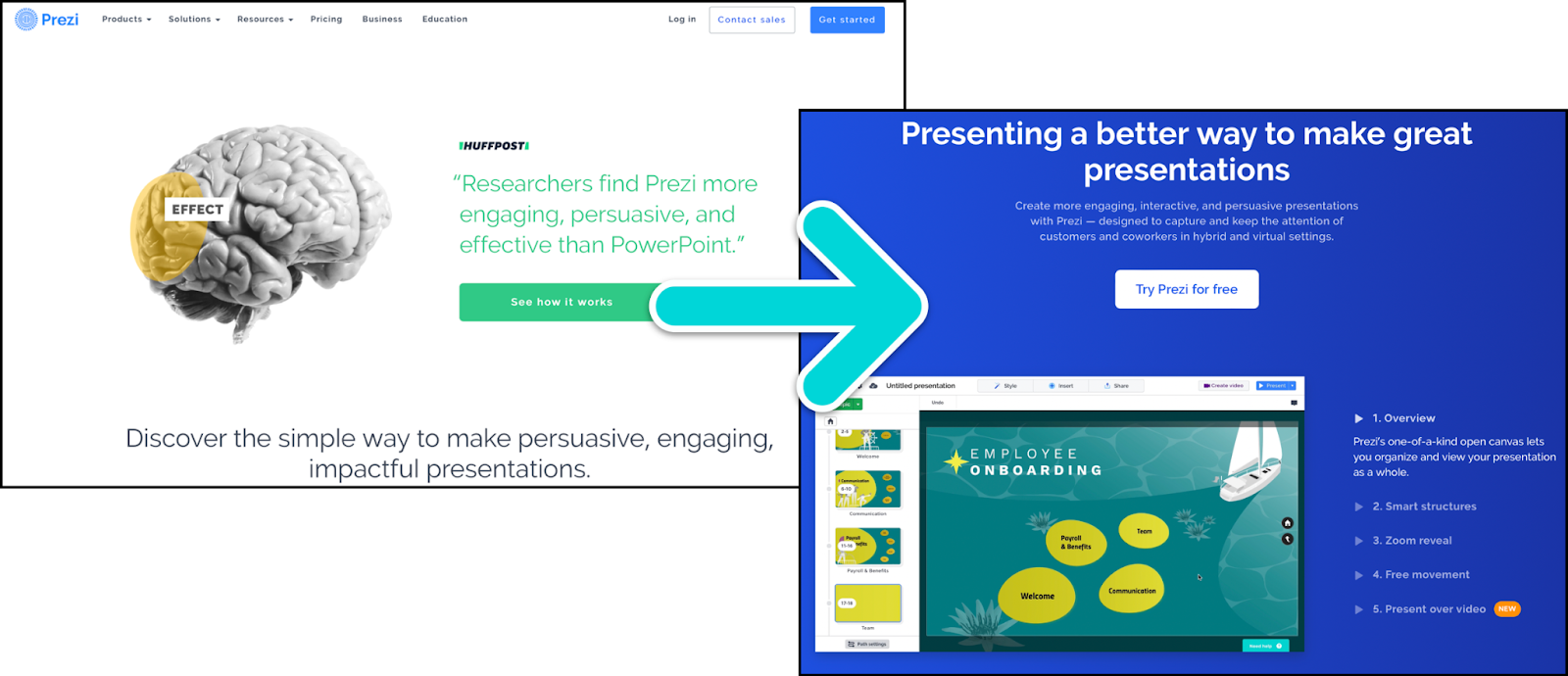
Source: Prezi
Reprise, Retool, Datadog, and InVision take us through the product and its use cases before even signing up for a free account. However, the popularity of watching a product tour is only next to signing up for a free or trial account.
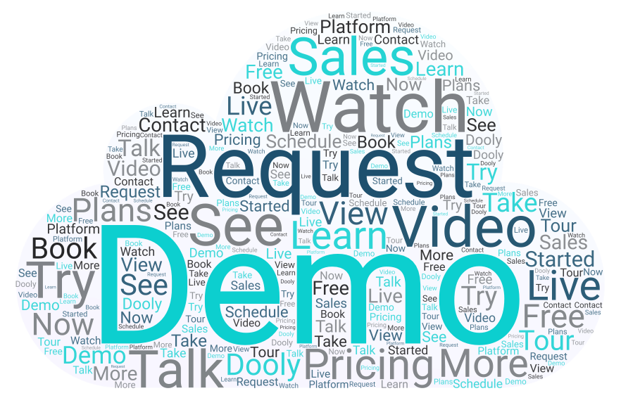
Observation #6: For the Love of Demo
Schedule, Watch, Request, Book, Get, Live - whatever the preceding word is, showing the product in-action to a potential customer is still a crowd favorite. Most PLG companies with a sales-led motion on top of product-led love the opportunity to guide a user to their aha! moment.
The most common secondary (sometimes the primary) CTA on product-led websites is to get the user to a demo.
Observation #7: Learning is Taking Action
Depending on the use case and niche, some products come with a steep learning curve. Take Confluent for example. In their own words, “Confluent platform acts as a central nervous system that lets companies connect all their applications around real-time streams”. Got it? Me neither!
Which is why Confluent encourages their potential users to watch a demo. To be accurate, it should read ‘Request on-demand demo’. Clicking a button that says ‘Watch Demo’ and finding a form instead of a video might be disappointing for a potential user for a minute.
But, Confluent uses the form to determine how fluent you are in Kafka (google it) to show you the right demo. They clearly explain how long the demo session is and what to expect in the video. They incentivized the experience with a $400 credit to explore the product for free during the video!
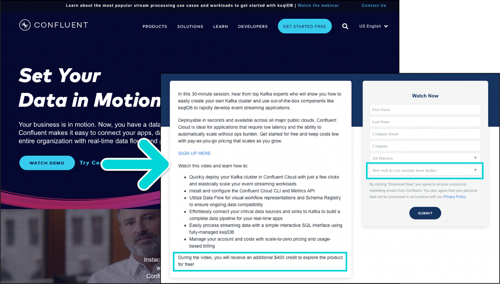
Source: Confluent
Confluent knows their ideal users and are segmenting them at the very beginning based on their subject matter knowledge - which is of significance in this case.
FullStory and Venafi are more examples of product-led companies focusing on educating the user before even considering their solution.
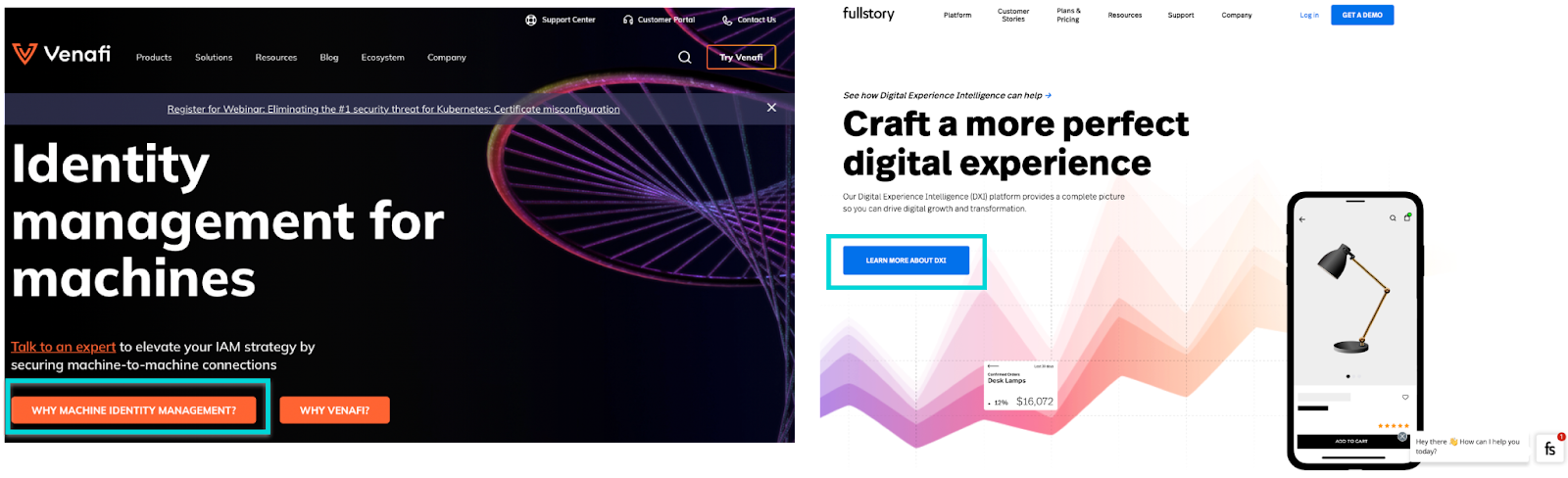
Source: Venafi and FullStory
Observation #8: Speaking to Your Ideal Users
Speaking of products for niches, not all PLG products want a wider top for their funnel. Some want the right audience to sign up. Take Cypress for example. Clearly, they are talking to developers through their CTA.
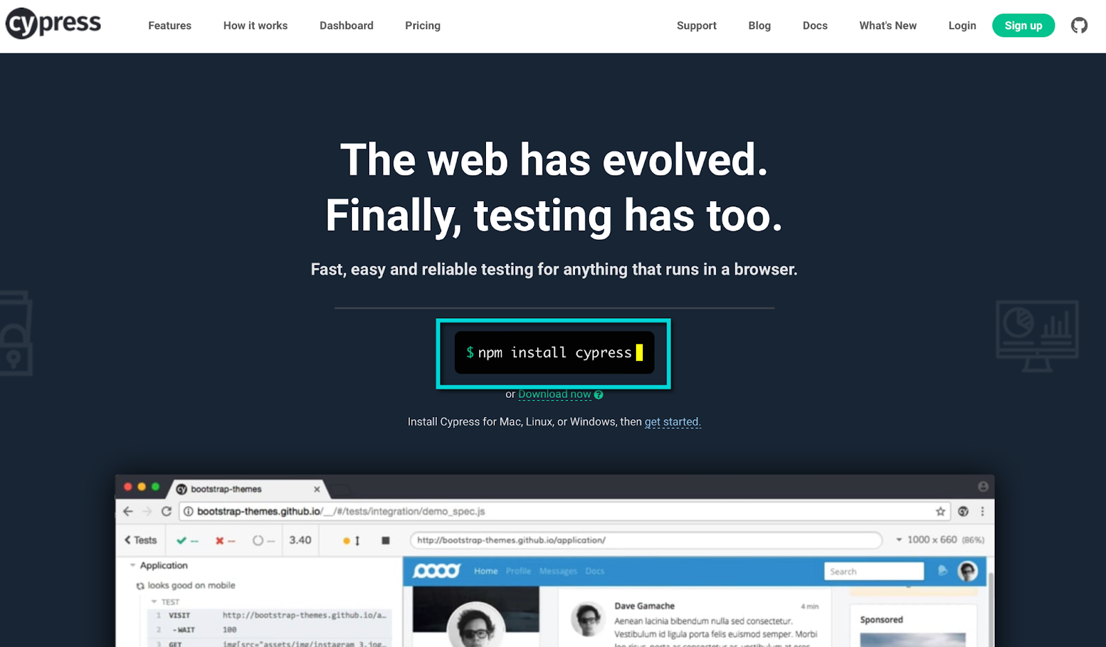
Source: Cypress
Observation #9: Social Proof
This comes in a few variations. Product-led companies are big on gaining customer trust. The CTA is closely followed by customer testimony, logos of customer companies, the number of users or companies that signed up, or assurances like ‘No credit card needed’.
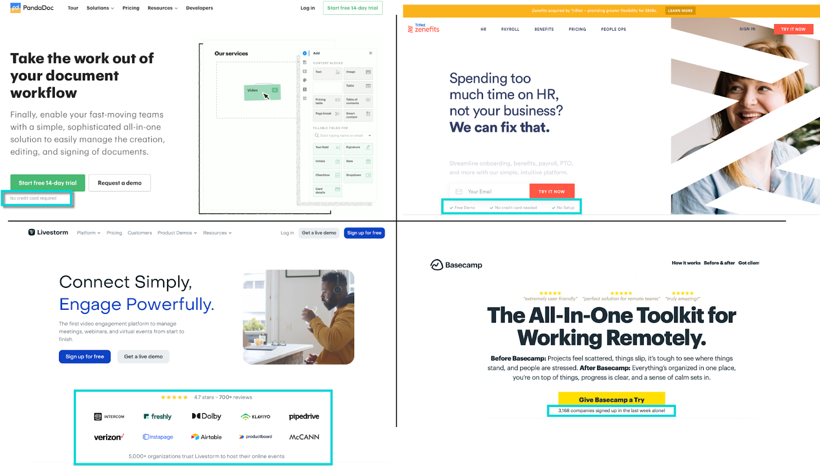
Sources: PandaDoc, Zenefits, Livestorm, and Basecamp
Observation #10: Dynamic CTA
Personalization is hard to implement on a homepage CTA. But, a dynamic or smart call-to-action based on the user’s tech environment is certainly do-able. Grammarly uses at least three different CTAs based on the browser and the device you are using.
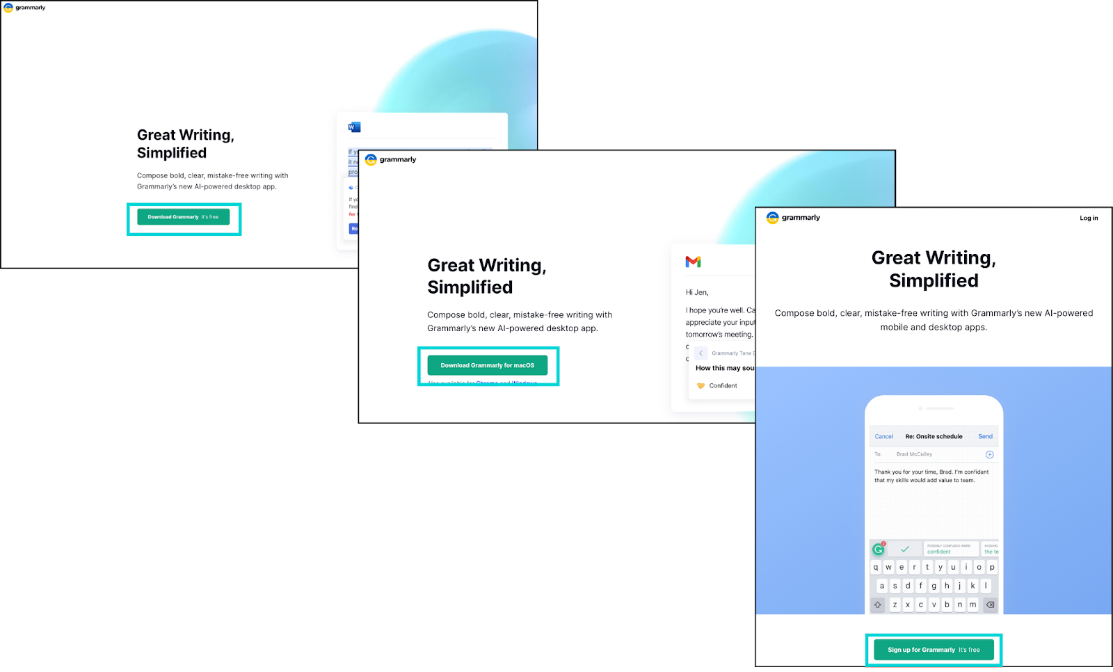
Source: Grammarly
To Wrap Up
Though product-led growth has a natural affinity to experimentat, most of us like to play it safe when it comes to the CTA. Like any good website, product-led websites take clear and concise messaging, setting the right expectations, and delivering on the promise to a user seriously. Product-led companies also prefer showing instead of telling the users what they are signing up for. In other words, the user gets a glimpse of the product value very early.
My biggest learning from analyzing over 50 product-led growth companies’ homepages is that - there are classic best practices around creating the most impactful CTA and there are outliers to the rules.
If you’ve done some experimenting with your website CTAs, we’d love to hear how it went. Join the discussion.